

A UX Audit for 'Mayson.Dev'
(a Backend as a Service Platform)
👇🏼 Read Full Audit Here: https://drive.google.com/file/d/1kfpxyYYJzZzI2u2w_vX2Za9vEzv0MOxY/view?usp=sharing
👉🏼 The Product Evaluated: https://mayson.dev/
A self-initiated UX audit of Mayson.dev, an AI-powered Backend as a Service platform that enables users to build and deploy production-grade full-stack applications through simple text prompts, without writing a single line of code.
The goal of this audit was to evaluate the complete first-time user journey, from the moment a new visitor lands on the website, through account creation, all the way to building and deploying a live backend application - and identify opportunities to improve usability, accessibility, trust, and overall experience quality.
The audit covered the complete first-time user journey across four key areas:
Landing Page – Evaluating first impressions, value proposition clarity, and CTA effectiveness
Authentication Flow – Reviewing the signup and login experience for friction, accessibility, and legal compliance
App Creation – Analysing the prompt input experience, onboarding modal, and method selection flow
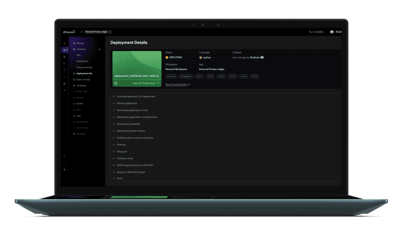
Deployment & Sharing – Assessing the generation pipeline, APIs dashboard, and post-deployment experience
" Key observations were mapped against established UX principles including Nielsen's 10 Heuristics, or laws like, Fitts' Law, Hick's Law, Jakob's Law, and WCAG 2.1 accessibility guidelines "
Phase 1: Heuristic Evaluation & Journey Mapping
The audit began by walking through the entire first-time user journey as a new visitor would experience it - with no prior knowledge of the product. Each screen was captured and assessed individually, with observations logged in real time as interactions were made. This approach ensured that the evaluation reflected a genuine first impression rather than a familiarity-biased review.
During this phase, I paid particular attention to moments of friction, confusion, or delight - noting not just what was broken, but also what was working exceptionally well and why. Positive design decisions were documented with equal rigour, as understanding what works is just as important as identifying what does not.
Phase 2: Observation, Classification & Severity Rating
Each observation was classified into one of three categories - a positive finding worth preserving, a critical issue requiring immediate attention, or a suggested improvement representing an enhancement opportunity. Findings were then tagged with the relevant UX principle or heuristic they violated or upheld, and assigned a severity rating based on their likely impact on user behaviour, trust, and conversion.
Particular attention was given to the product's accessibility posture. The absence of a light/dark mode toggle, for example, was evaluated not just as a visual preference but as a genuine WCAG compliance concern - addressing the needs of users with photophobia, astigmatism, cataracts, and other visual conditions that make single-theme interfaces exclusionary.
Phase 3: Synthesis & Report Production
Following the evaluation, all findings were consolidated into a structured audit report featuring annotated screenshots for every screen reviewed, observation cards clearly marked by severity, the relevant UX law or heuristic cited for each finding, and a prioritised action plan separating immediate fixes from sprint-level improvements and longer-term roadmap items.
The report was designed to be immediately actionable for both a product team and a design team - presenting findings in a format that bridges the gap between UX critique and product decision-making.
The Outcome
The audit identified 73 observations across 13 screens, 22 strengths, 27 critical issues, and 24 suggested improvements. Among the most significant findings were a misrouted authentication CTA that sent new users to a login screen instead of signup, placeholder copy that had shipped to production, the complete absence of a post-deployment success state, and no shareable link surfaced after a user's backend went live - a direct gap in the product's core promise of "deploy and share instantly."
At the same time, the audit highlighted genuinely impressive design decisions that set Mayson apart - including the creative use of mini games during build wait times, and an auto-generated app name and description that demonstrated remarkable prompt comprehension.
These moments were documented as strengths to be preserved and expanded upon, not just treated as background context for the issues.


