

⏮️ Previous layout: https://web.archive.org/web/20231030050635/https://knghealthcare.com.au/
▶️ CASE STUDY: https://gamma.app/docs/CASE-STUDY-Covax-Australia-to-KnG-Healthcare-q9kokgrx4bp6cwa
The Brief
A relatively recent project with my current organization (operates in healthcare primarily), I was responsible for redesigning their website with a focus on improving user experience and ensuring that information was both accessible and intuitively presented to users, especially patients and caregivers.
Home Page – Highlighting services, a quick look at services, and featured healthcare content.
Product Page – Displaying their products with clear information, a smooth browsing experience, and easy access to purchase options, all customized for the industry.
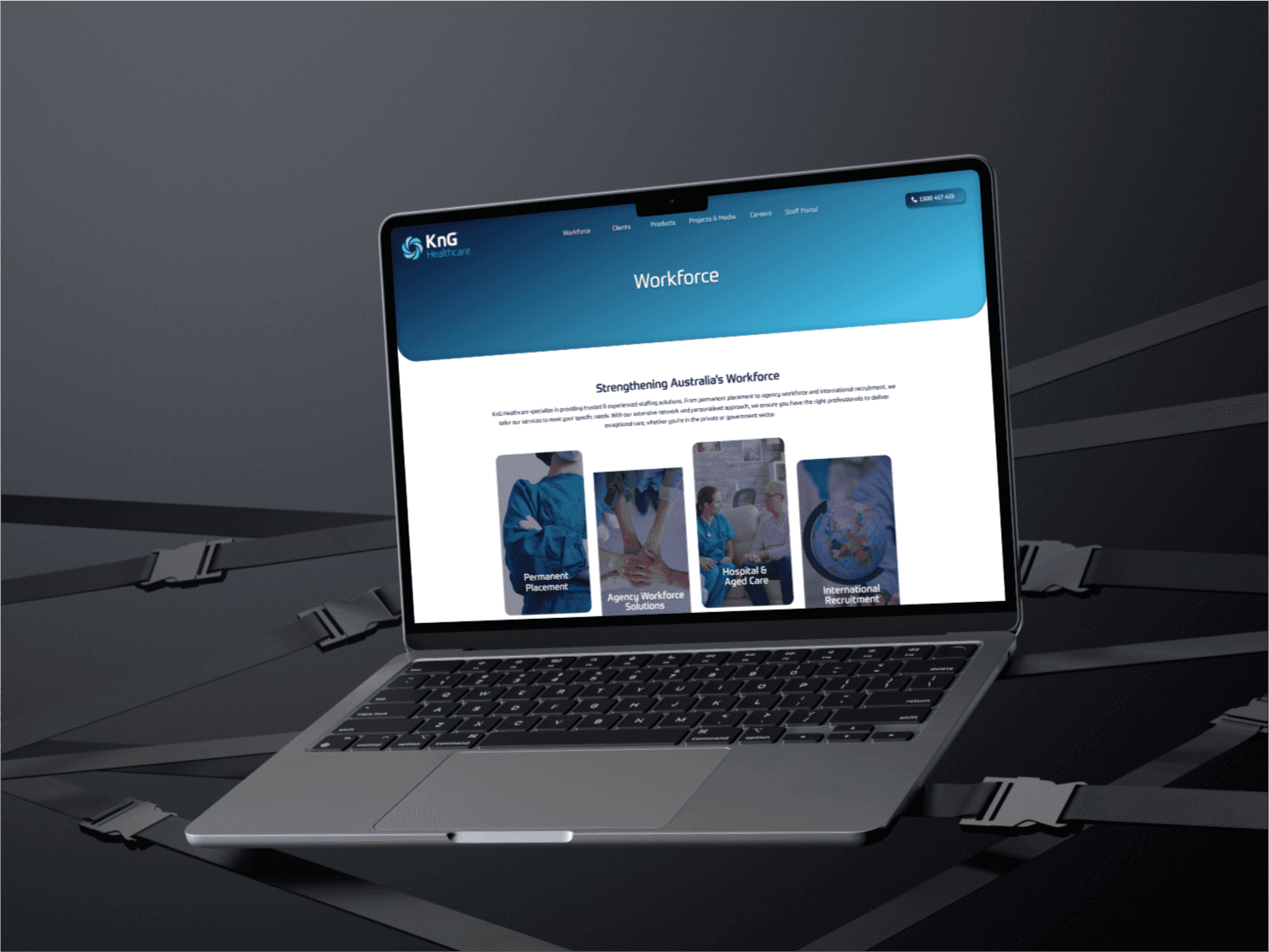
Services Page – Organizing their core services by category for easy navigation.
Contact Page – Making it simple for users to find contact information, and a relevant form.
"The designs were first shared with both the management and the development team to gather early feedback and make adjustments before moving into high-fidelity designs."
- Phase 1: Wireframing and Initial Concepts
To begin, I conducted several brainstorming sessions with the project management team and healthcare stakeholders to understand their goals, user needs, and any pain points they had identified in the current site. From these discussions, I was able to outline a comprehensive structure for the website, focusing on key user journeys, such as booking appointments, accessing healthcare information, and finding contact details for various departments.
- Phase 2: Mockup Design and Prototyping
Once the wireframes were approved, I proceeded to develop high-fidelity mockups in Figma. Given that the website had a large amount of information, the design focused on creating a clean, uncluttered look with a consistent layout, easy-to-read typography, and a color scheme that consistently matched with logo provided, which was only point of reference for theme design.
- During this stage, I collaborated closely with the development team to ensure that the mockups were feasible for implementation. Key aspects of this process included:
- Responsive Design: Ensuring that the design would work well on both desktop and mobile devices, given the range of users accessing the site.
- Accessibility: Making sure that color contrast and font sizes met accessibility standards, especially important in a healthcare context.
- For user testing, I created an interactive prototype that simulated the main user flows, such as navigating to services, finding contact information, and other information.
This allowed all the people involved to experience the website as users would and provided valuable feedback that led to further refinements.
- Phase 3: Finalising the Design
When in the final stages, I coordinated additional discussions with both the management and development team to address any last-minute feedback and align on design handover requirements. Even after the design handover, the collaboration with developers was critical, as we worked together to ensure that the design would be implemented precisely as intended, down to the pixel level, while also being optimized for performance.
The Outcome
The final website design improved user engagement metrics, with users spending more time on the site and reporting a more intuitive navigation experience. The management team was pleased with how well the design aligned with the organization’s values, overall theme, and the development team appreciated the clear communication and smooth handover process.


